
Friday, December 2, 2011
Motion Photo
Friday, June 3, 2011
frog tongue

Thursday, June 2, 2011
Avatar/alger-ego
Thursday, May 26, 2011
Personal Ad
This assignment was to create a business card promoting yourself as a graphic designer. I picked eight of my works, and put a filter on my name and the shapes. I also used a gradient for the shapes.


Monday, May 23, 2011
The Memory Project
This assignment was for The Memory Project, an organization for which art students create portraits for orphaned children around the world, because many of these children don't have any pictures of themselves. I chose a picture of a little girl from Rwanda named Ange to use for my portrait. I added the dogwood flowers in the background because they are the Virginia state flowers, and I wanted to contribute something personal to the portrait, and have it connect to where I (the artist) am from. I think The Memory Project is a really good idea, and am glad to have contributed.


Tuesday, May 17, 2011
color wheel

Wednesday, May 11, 2011

Tuesday, May 10, 2011
Christopher Clark ARTnews
This assignment was to read through ARTnews magazine and choose an artist who's work inspires us. I chose Christopher Clark, specifically his "ROYO Equus" collection, featuring people with horses. I'm not actually really in to horses, but I really like how all of the paintings in this collection look. I like the use of color, and how you can see the brush strokes. The paintings have a romantic and impressionist style.


Monday, May 9, 2011
faces
This assignment was to take a face and make half of it looks "inside-out," and make it look like a machine. I started playing around with the blond-haired face first, and I didn't add any mechanical stuff, but I thought it looked cool. For the other face, I took the terminator, put it on top, and changed the opacity, and painted pink over it.


Wednesday, April 27, 2011
impressionist paintings
For this project, we had to take pictures and make adjustments so they look like impressionist-style paintings. I used different filters, photo filters, and brush strokes to achieve this effect.


Monday, April 25, 2011
Comic Strip
For this project, we had to take pictures and create a comic strip. I worked with Julia, and we used a joke we found on the internet for our comic.


Wednesday, April 20, 2011
panorama
This assignment was to take three picture and put them together to create a panorama effect using Photomerge.


Wednesday, April 13, 2011
Chairs


Thursday, March 31, 2011
midterm

Tuesday, March 29, 2011
cubism thingy

kaleidoscope


Friday, March 25, 2011

Monday, March 21, 2011
Self Portrait Grid

Wednesday, March 16, 2011
Pixlr.com Review
Pixlr.com is a website that allows users to work with a Photoshop-style picture editing program. It has the same toolbar and tool icons as Photoshop, which is useful. Pixlr is kind of a basic version of Photoshop, with less of a variety of options and less precision than Photoshop. However, it does have some different filters that aren't available in Photoshop. Pixlr is a good website for basic Photoshop functions, but it isn't as easy and comfortable to use as Photoshop, and over-all not as good. I would recommend Pixlr for people who don't have Photoshop, but want to edit pictures occasionally for fun and don't want to invest in Photoshop.
.
Created on Photoshop^^
Tuesday, March 15, 2011
Grids


Thursday, March 10, 2011

Monday, March 7, 2011


Wednesday, March 2, 2011
Abstract


Monday, February 28, 2011
negative space-swan
(oops, I thought I already posted this...)
 This was the same assignment as the silhouette of myself, but we were instructed to also make one of an object or animal. I chose a swan because I thought it would be cool to incorporate textures of feathers and water into the design. I chose to stick to mostly black and white and grays in order to keep it more simple and not distract from the design. I thought this was a cool assignment and am happy with how it turned out.

Negative space-silhouette

Friday, February 18, 2011
Pandaguin

Thursday, February 10, 2011
15 Green Things

Tuesday, February 1, 2011
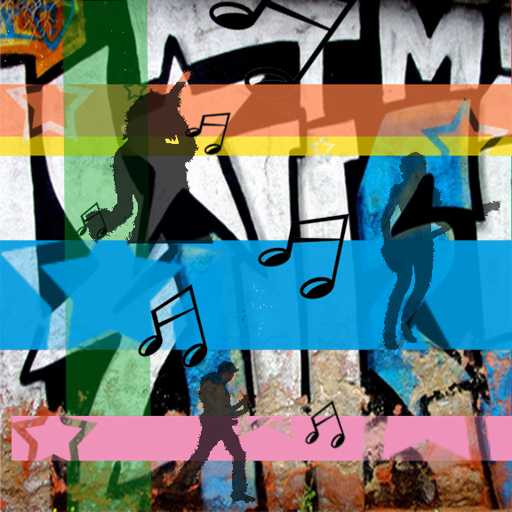
Music Project #2

Music Project
Friday, January 28, 2011

Subscribe to:
Comments (Atom)