Friday, June 1, 2012

hands and feet

This picture is from an older roll (hands & feet). I like the high contrast between the light and the shadow, and the weird angle of the hand.

Shape/form

This picture shows the "shape and form" element of design, because of the 3-dimensional statues, and also shows the depth of field, with the front statue in focus and the ones in the far background slightly blurred.

people with interesting backgrounds digital

This picture was on my 'people with interesting backgrounds' digital roll. I liked how the subject was close up, and the background included people-like figures. 

People with interesting backgrounds

This was another picture on the 'people with interesting backgrounds' roll. I thought it was cool how the person kind of blends into the background. 

People with interesting backgrounds


This picture was taken at the Greenwood grocery store. I liked the different patterns in the picture, from the stripes on the sweater to the shiny spheres in the background, and the clay pots. I also like that the person isn't looking directly at the camera.


Friday, March 23, 2012

Solarized high contrast

This picture was one from my High Contrast roll. This picture was solarized, although it is kind of hard to tell from looking at it here. I adjusted the curves/levels to and adjusted the contrast and brightness to bring out the lights and darks.

Still Life 2

This was another picture from my Still Life roll. It was right next to a glass door in my kitchen on a sunny day, so I liked how the light was reflecting off of the glass jars.

Still Life/Vintage

This was the Still Life and Vintage roll. I combined the two assignments by taking still life pictures of vintage things, like the shoes, necklace, and shoebox in this picture. I thought the perfume bottle added to the theme and the glass and liquid added interesting contrast in the picture. 

Friday, January 6, 2012

Photogram

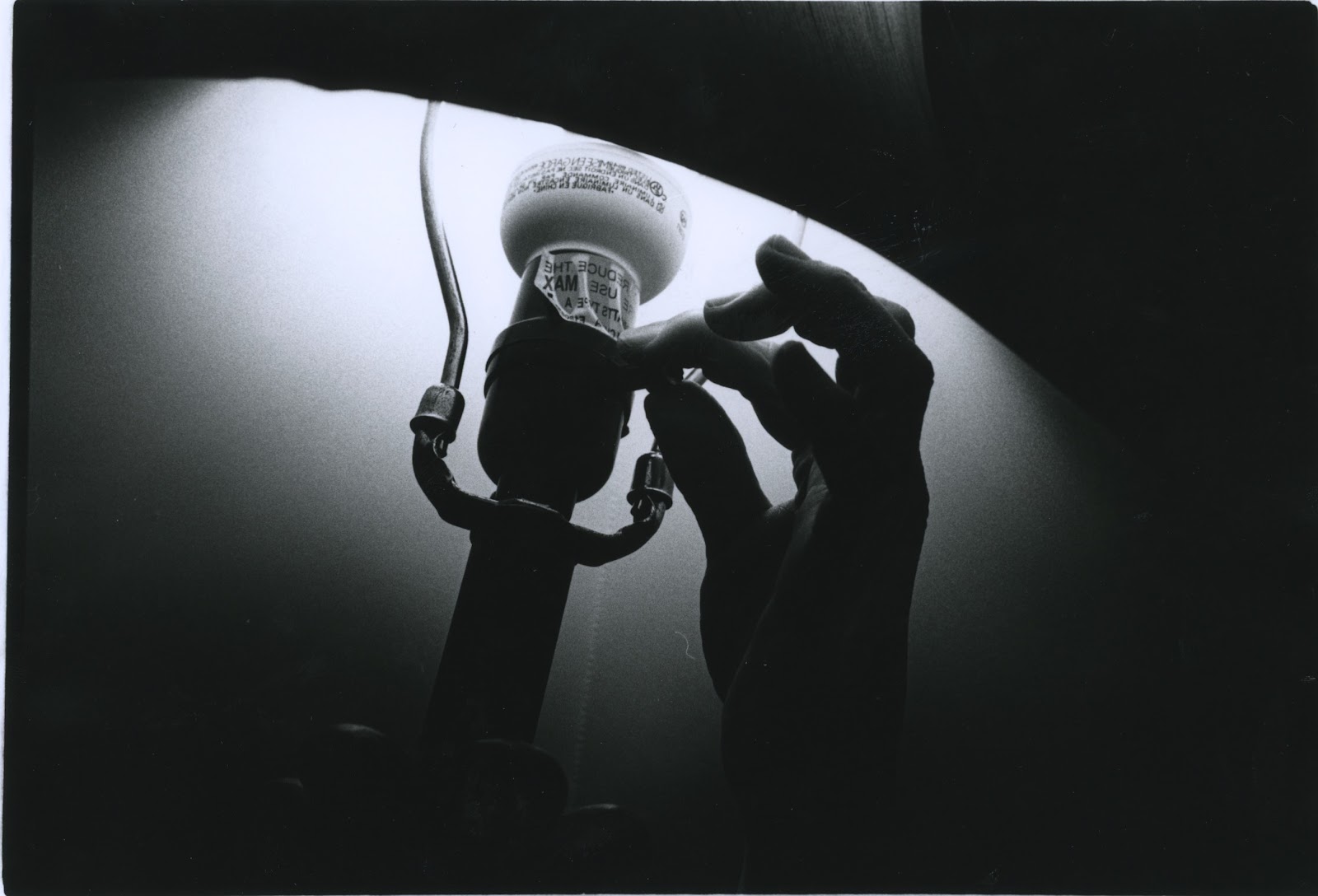
This was the very first thing we did using the enlarger and developing. I thought it was a really cool assignment, and I hadn't ever seen anything like it before. I adjusted the brightness, contrast, and levels, to make the lights and darks stand out a little more than on the original picture.

Scavenger Hunt

This picture was taken for the first roll, the scavenger hunt. When I developed the picture, I forgot to use a filter, so it came out kind of gray. I changed the brightness and contrast using Photoshop, and I think it looks kind of cool with the different shades of gray.

Wednesday, January 4, 2012

Hands & Feet

This was for the hands and feet assignment. I really like the subject of this picture, and the fact that it incorporates both hands and feet. I also think the writing on the hand and the texture of the sweater is interesting.

Depth of Field

This was for the depth of field assignment. I used a small aperture number in order to focus on the flower while making the background very blurry. I adjusted the brightness and contrast from the original print, which was more gray and had less contrast. 

Framing

This was for the framing assignment. I used the railing of a deck as a frame for a tree branch behind it. I adjusted the levels and curves of the original picture to add more contrast.

Architecture

This picture was for the architecture assignment. It is a picture of my back deck. The original print was a little bit too light since it wasn't exposed for long enough, so I adjusted the exposure and levels.

Leading Lines

This picture was taken for the Leading Lines assignment. I chose to focus on the chalkboard and door, and have the bar be the line that draws the eye to the subject.